Postcards are the perfect way to reach customers and stand out from the crowd. No other advertising medium gives you more control over which customer is contacted at exactly which time with which message. And the best part? Well-made postcards are kept by customers for a long time and still lead to conversions several weeks later.
For that to happen, the design needs to be right and include all important elements. Only then will your mailing become a full success. In this article, we guide you step by step through the structure of your perfect postcard.
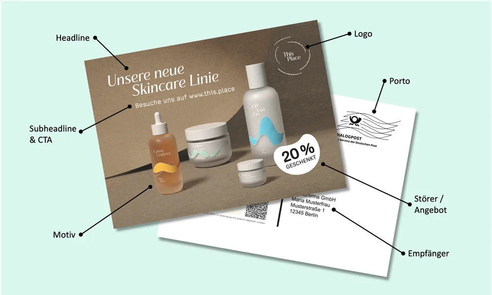
The front: everything important at a glance
A well-made front side manages to communicate all important information in less than 3 seconds and answer your customer’s questions: who is this postcard from? Why am I receiving it? What do I get? To do that, it must capture the customer’s attention at first glance and contain a clear structure with clear elements.
Headline
Your headline is your hook. In fewer than 10 words, it needs to answer why you are writing to your customer. What is the occasion? What do you want from them?
Especially for new-customer mailings, this requires a detailed understanding of your target audience. What problems do they have? How can your product solve them?
For existing-customer mailings, this is significantly easier. Your customers already know you and your brand. Here, the primary goal is to communicate the occasion as clearly and authentically as possible.
Most existing-customer mailings fall into one of the categories winback, cross-selling and VIP customers. Clear messages are more important than maximum creativity. If you cannot think of anything original, keep it simple. A variation of these classics often does the job.
-
Winback -> We miss you!
-
Cross-selling -> Do you already know all our products?
-
VIP customers -> We want to say thank you.
Pro tip: the cocktail-party effect also works with text. There is little your customers prefer reading more than their own name. Use this effect by addressing your customer personally as part of the headline directly on the front, for example “Max, we miss you!”.
Subheadline
You can use the subheadline to explain the headline, create more context or use it directly as a call to action. Is your offer new, free, simple or special in some other way? The subheadline gives you the opportunity to highlight that. With a well-made subheadline, you can direct customers straight to your offer. The key here as well is to stay short and concise.
Depending on how clear and concrete your headline was, the subheadline is optional.
Some examples are:
-
We are giving you 20% off your next order!
-
Your gift is already waiting for you!
-
Visit us at www.sampleshop.com
-
Exclusively for club members only
-
Treat yourself to something good again.
Motif (key visual)
The key visual is the first thing that catches your customer’s eye. It must be suitable for capturing attention and evoking emotions. In addition to the image element, you can play with different colors to deliberately highlight elements, create a harmonious overall look or deliberately create contrast.
Elements that usually work well:
-
Smiling people. Ideally, they look directly at your customer.
-
Your products, especially if your brand has high recognition.
-
Animals. Who does not like a cute cat or dog photo?
You can also combine several elements. For example, if you sell dog food, a combination of a cute dog and your food is a good foundation. Just make sure the card does not become overloaded.
Pro tip: many DTC brands have committed to being a love brand for their customers. Show who is behind the company. Depending on the occasion, a team photo can be an excellent key visual, make your brand feel approachable and, in addition to the campaign, increase customer loyalty.
Logo
Use the recognition value of your logo to tell customers directly that you are the sender.
Badge / offer
Your postcard should primarily fulfill one goal and move customers to act. For that, it is essential that you tell them what they get. Use a badge or prominently placed offer to communicate exactly this incentive.
Example: you are giving your customer 20% off the next order? Put it into a large red bubble with 20%.
Many merchants unfortunately avoid a prominent badge for aesthetic reasons. Do not make the same mistake. The most beautiful postcard is useless if your customer does not take action.
URL
Depending on how full your front side already is, we usually recommend including your shop URL on the front. This helps customers bridge the media break and take action with one glance at the front.
Back side
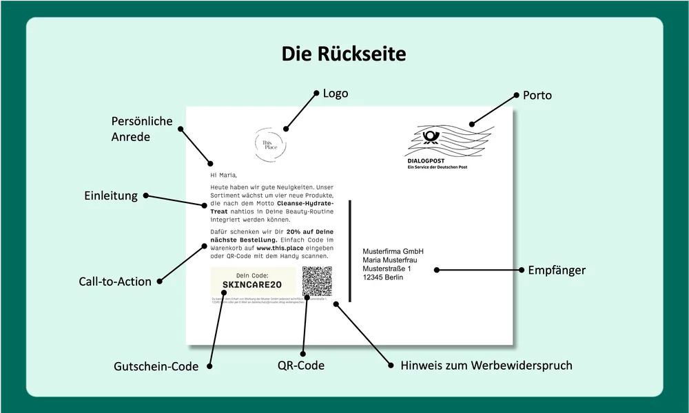
On the back, you summarize your offer again and explain to the customer what they need to do to receive it.
Personal greeting
Everyone likes hearing and reading their own name. Use this effect to keep your customer’s attention by addressing them personally. Even though most customers today know that this was automated through variables, it still shows appreciation compared with an impersonal mass mailing.
Pro tip: every shop owner knows how creative some customers can be when entering address data. To prevent personalization from backfiring, it is important to prepare shipping data cleanly. Before every shipment, PostPal checks and corrects whether the name entries in your shop are suitable for shipping.
Introduction / copy
After the personal greeting, it often makes sense to pick up the context of the mailing again. Our recommendation here is: keep it short. The rule is: as much as necessary, as little as possible.
This element is optional, but it can be used skillfully for storytelling. Feel free to remind customers what your brand stands for.
Call to action
Repeat your offer and explain in detail what the customer needs to do to get it. Be very specific. For example, say exactly which product they need to add to the basket and where they can enter the voucher code, usually at checkout. Be sure to include your URL as well. Ideally, use your homepage to avoid making customers type a long landing page.
Offer / voucher code.
The core element of your back side. Position your offer, usually a voucher code, clearly. Boxes have proven useful here, or at least a dedicated line. Bold and/or colored text catches the eye directly.
Optional design elements
Depending on the occasion and how much space you still have, you can add further optional elements. The most relevant are:
-
QR codes: they are still used only rarely in Germany, but some customers do use them. For these customers, you can make life easier. Use a targeted landing page and prefill the voucher for your customer so it is automatically inserted at checkout.
-
Logo: corporate identity never hurts. If you still have space and do not know what to do with it, simply use your logo.
-
Signature: a scanned signature, for example from the managing director, increases the personal touch of the mailing.
-
Images, especially for larger formats: you can also use images on the back. Because this can quickly make your design look overloaded, it is especially suitable for larger formats such as DIN long or DIN Maxi.
Note about advertising objection
The most important point first: you do not need your customers’ consent to send them postcards. That is the big advantage that allows you to contact almost 100% of your customers.
However, you are generally still required to inform customers that they can object to the use of their data for advertising purposes at any time. To be on the safe side, you can add a short sentence in readable size at the end of your card. Example:
You can object to receiving advertising from Muster GmbH at any time in writing to ADDRESS or by email to privacy@muster.shop.
Implementation
When creating the design, you can generally use any graphics program. We recommend creating it in InDesign, but Photoshop or Canva are also suitable for your design.
Because these are print products, however, you need to observe a few specifics compared with web design. The two most important differences:
-
Use high-resolution images with at least 300 dpi. On screen, it is important that images do not become too large so websites load quickly. For print, however, you should use the best possible image resolution. Otherwise, you risk the printed image appearing pixelated.
-
CMYK color mode. While you normally work in RGB color mode for the web, you should switch your image-editing program to CMYK for print products. Otherwise, slight color shifts can occur between your design and the postcard when printed.
In addition, you need to plan bleed all around your postcard design and extend image elements into this area. At PostPal, the bleed is 3 mm.
So your mailing can be processed automatically by Deutsche Post during shipping, certain zones on the card must remain free: coding, address and postage zones.
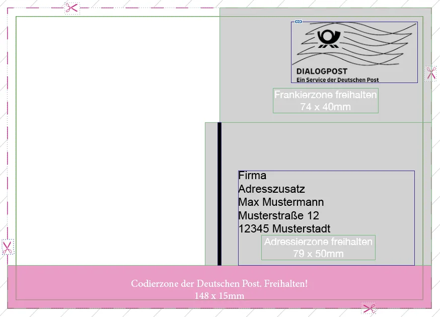
In PostPal, you can download design templates in your account under Designs.
Need help?
Feel free to contact us at any time if you need help preparing your print file. Use our contact form or write to service@getpostpal.com.